What if the data was already there, just not connected?
PADIKITA.ID · AGRICULTURAL ANALYTICS DASHBOARD
Rice data at the Department of Agriculture of Bulukumba was already being collected. The problem was that it lived across separate files, manual reports, and disconnected workflows.
The Problem
The issue was not a lack of data.
It was the way the data was being managed.
Rice commodity information was still spread across multiple files and documents, making consolidation difficult and increasing the risk of duplicated or inconsistent data. Producing a visual report also required several manual steps before the information could reach decision makers.
Field complaints had a similar problem. Reports from farmers were received through separate messages, which made them difficult to organize and review as structured information.
The challenge was simple: turn scattered agricultural data into one source that was easier to update, understand, and monitor.
The Approach
I started by identifying what the system actually needed to support.
Through observation and interviews with the Department of Agriculture, the requirements were organized around several core needs: centralized data input, interactive visualization, regional filtering, digital farmer reporting, responsive access, and a system simple enough for staff to maintain.
The project followed a structured SDLC Waterfall process, moving from requirements analysis and system design to implementation and testing. The system architecture was deliberately lightweight: Google Sheets for the data source, Looker Studio for analytics and visualization, and Padikita.id through Blogger as the public-facing interface.
The Solution
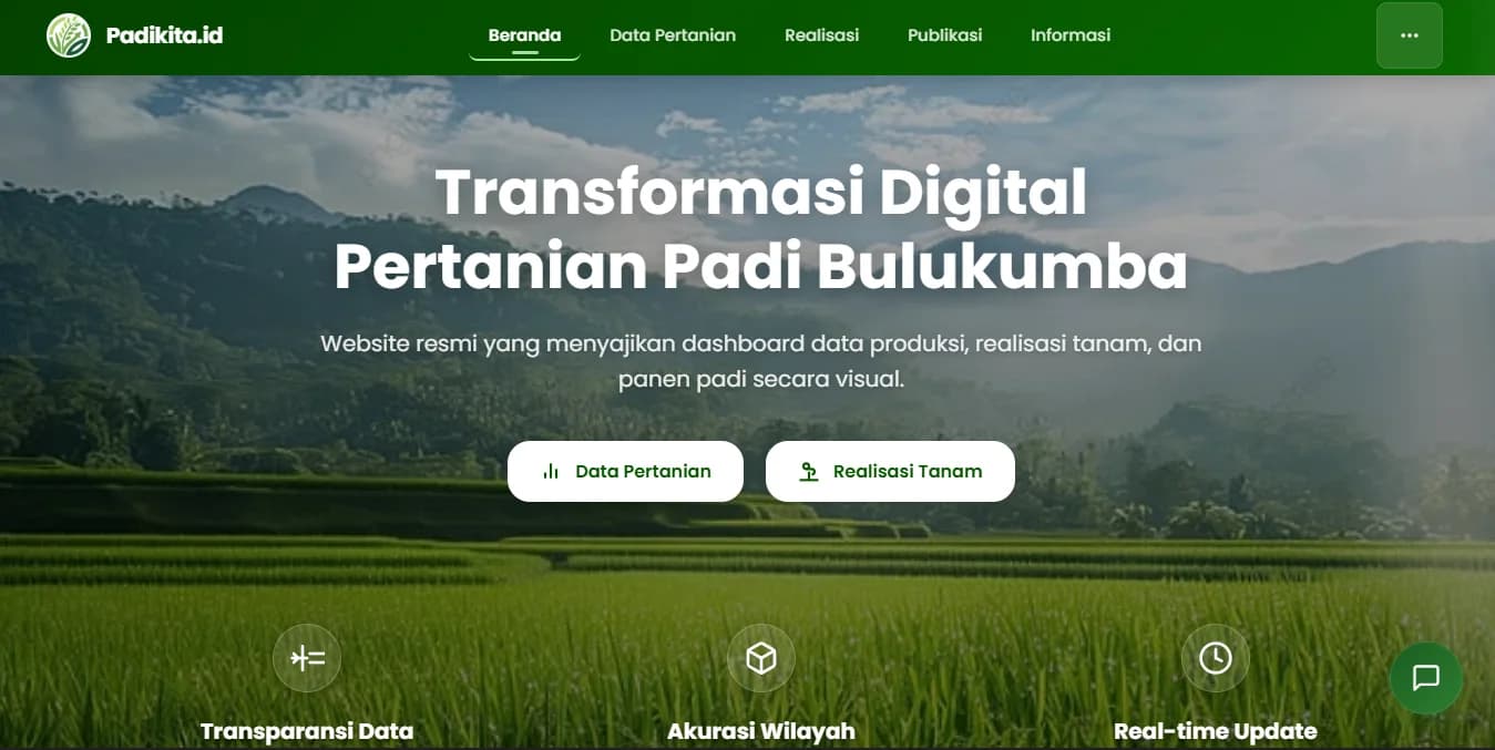
Padikita.id became a centralized analytical portal for rice commodity data in Bulukumba.
The dashboard presents information such as:
- Harvested area
- Production
- Productivity
- Farmer groups
- Pest and disease distribution
The information is presented through interactive charts, indicators, spatial maps, and regional filters so users can explore the data more clearly.
The system also includes a digital complaint form that gives farmers and field users a more structured channel for reporting problems.
Instead of rebuilding reports every time the data changes, staff can update the source in Google Sheets and the connected Looker Studio dashboard reflects those updates automatically on Padikita.id.
Outcome
The biggest change was not simply having a dashboard. It was simplifying the workflow behind the information.
Before Padikita.id, creating a visual report required around five manual stages. After implementation, the core workflow was reduced to updating the connected Google Sheets data source.
The study calculated this as roughly an 80% reduction in manual process stages. Data that had previously been distributed across more than three files could also be managed through a centralized source.
Access to information became more direct through the near real-time dashboard, while repeated manual transfer of data was reduced. Farmer complaints could also be collected into a structured database instead of remaining across separate messages.
User Acceptance Testing produced a score of 86.67%, placing Padikita.id in the “Very Good” category and indicating that users considered it suitable as a supporting medium for agricultural data visualization and monitoring.
Importantly, Padikita.id was positioned as a tool to support information presentation and monitoring, rather than as a fully complex decision-support system.
What I Learned
A useful dashboard is not just about displaying more data. It is about reducing the distance between the data and the people who need to understand it.
Working on Padikita.id showed me how data structure, visualization, and simple digital tools can work together to improve an existing process without making the system unnecessarily complex.
It also reinforced something I keep coming back to: the technology only matters when it makes the information clearer, easier to maintain, and more useful to the people working with it.